
mCommerce in 2024: Mobile ECommerce Best Practices
Industry sources report that online shopping has been “mobile-first” for years, with rates that continue to grow. The Salesforce shopping index shows steady increasing rates of mCommerce over the past three years. As of Q2 2023, 64% of orders to their commerce platform came from mobile devices. That’s a 3% increase from the previous year, and a 6% increase from 2021. The same trend was apparent among at Shopify, where the majority of shoppers have been mobile for nearly 9 years.
Market reports show mobile commerce is expected to make up 70% of retail e-commerce sales by 2024. That equates to over 4 trillion dollars. 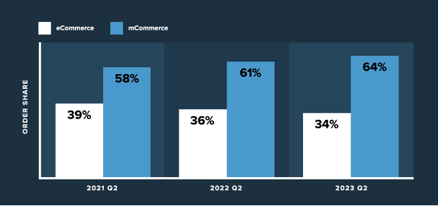
This mobile majority brings a different set of considerations for eCommerce teams building online shopping experiences. Let’s review the growth of mCommerce, new trends heading into 2024, and what technology eCommerce teams need in their tech stack to meet the needs of today’s mobile online shoppers.
What is mCommerce?
mCommerce, or mobile commerce, is online shopping that’s done on a mobile device. This includes browsing and purchasing items from a phone or a tablet. This shopping is done through a mobile shopping application (like Amazon or a retailers application. Or, through a web browser accessed from a mobile device. mCommerce offers convenience, speed, and flexibility for online shoppers to buy what they want, whentthey want it, from anywhere.
What is the difference between mCommerce and eCommerce?
mCommerce is simply a subset of eCommerce. ECommerce is online shopping – purchasing goods or services on the internet rather than through a physical experience (like going to a store or a market). mCommerce is eCommerce that’s completed from a mobile device. Shopping from a desktop or laptop computer is eCommerce, but shopping from a phone or tablet is mCommerce.
Most mCommerce Shoppers are New to Your Brand
What’s unique about mCommerce is that the buyers are often interatcting with your brand or porduct for the first time. Retail industry benchmarking firm Leading Lights works with leading SaaS companies to analyze their mobile eCommerce and traffic data, and has made some interesting observations about mCommerce shoppers. The firm recently shared that mobile traffic accounts for 76% of new visitors across retail sites, and 55% of that mobile traffic is made up of new visitors.
This data reveals an important takeaway for brands to consider as they prepare their mobile eCommerce site – more mobile shoppers are new to your site, and they’re coming from paid sources like digital advertisements.
“The face of the mobile shopper is different than that of desktop – new, and more likely to be paid. Brands and retailers need to anticipate the differences, segment the mobile experience to make the most of every visit, and avoid runaway acquisition costs.”
-Rick Kenney, Managing Director of Leading Lights
Brands must take mobile traffic seriously not only because they’re leaving a critical first impression, but also because they’ve paid for most of the traffic. Marketing teams are paying an acquisition cost to get that user on to their website, so there’s more at stake to ensure the experience is a good one.
New eBook: How to Optimize the mCommerce Experience
Several mobile eCommerce trends emerged in the last year driven by innovations in AR, VR, and AI technology. AR and VR are bridging the gap between physical and virtual shopping. AI technologies have enabled hyper-personalized product recommendations or discounts. And mobile digital wallets have empowered consumers to leave their credit cards at home, and emerging biometric technology is enabling payments to be made through a fingerprint or scan of an eye, both in eCommerce and in a physical store.
YOTTAA helps thousands of eCommerce teams and marketers optimize their websites to meet the needs of today’s online shoppers – including those coming from mobile devices. Gathering perspectives from YOTTAA experts and other mCommerce leaders, we’ve built an ebook that you can use as a guide to preparing for the mobile shopper in 2024. In this piece we dive deeper into these technological advancements in the mobile shopping space, the impact they’re having on the modern consumer, and advise how ecommerce sites can best prepare the best experience for the modern mobile consumer.