NEW eBook: 650 apps analyzed. Know which one’s really impact site speed.
Get in touch to learn more, or connect with a Yottaa eCommerce acceleration expert.
eCommerce industry resource covering a range of site performance topics, glossary terms, and performance benchmark data
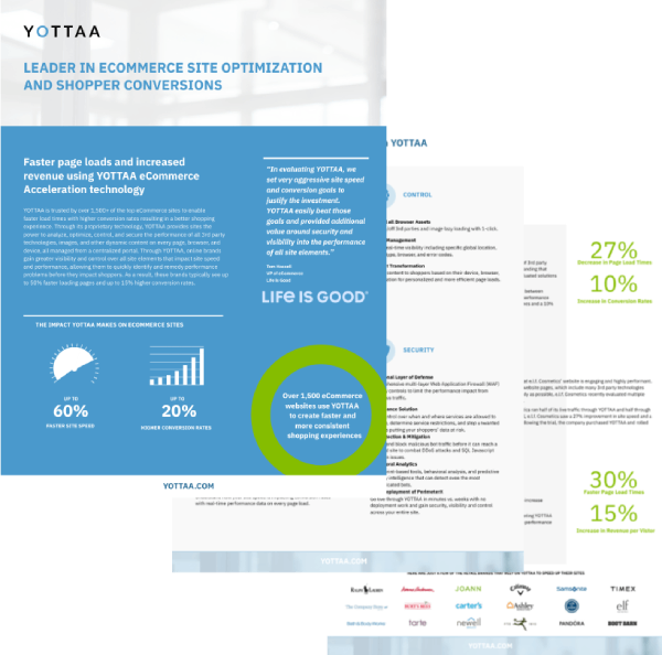
Powered by data from over 1,500 eCommerce sites, the Speed Hub’s benchmark allows brands to see how they stack up against the rest of the industry, including the performance impact of 3rd parties
We do have similar content available on our Resource page and Blog posts.


